I’ve been a loyal and generally satisfied user of NewsBlur ever since Google Reader was killed off. While Google didn’t think a web-based RSS reader was something worth having, not all of us agreed, and NewsBlur was an early beneficiary of that questionable decision. When you live in the 21st century and move from computer to tablet to phone and back, it’s nice having your feeds in the cloud and not tied to a single device.
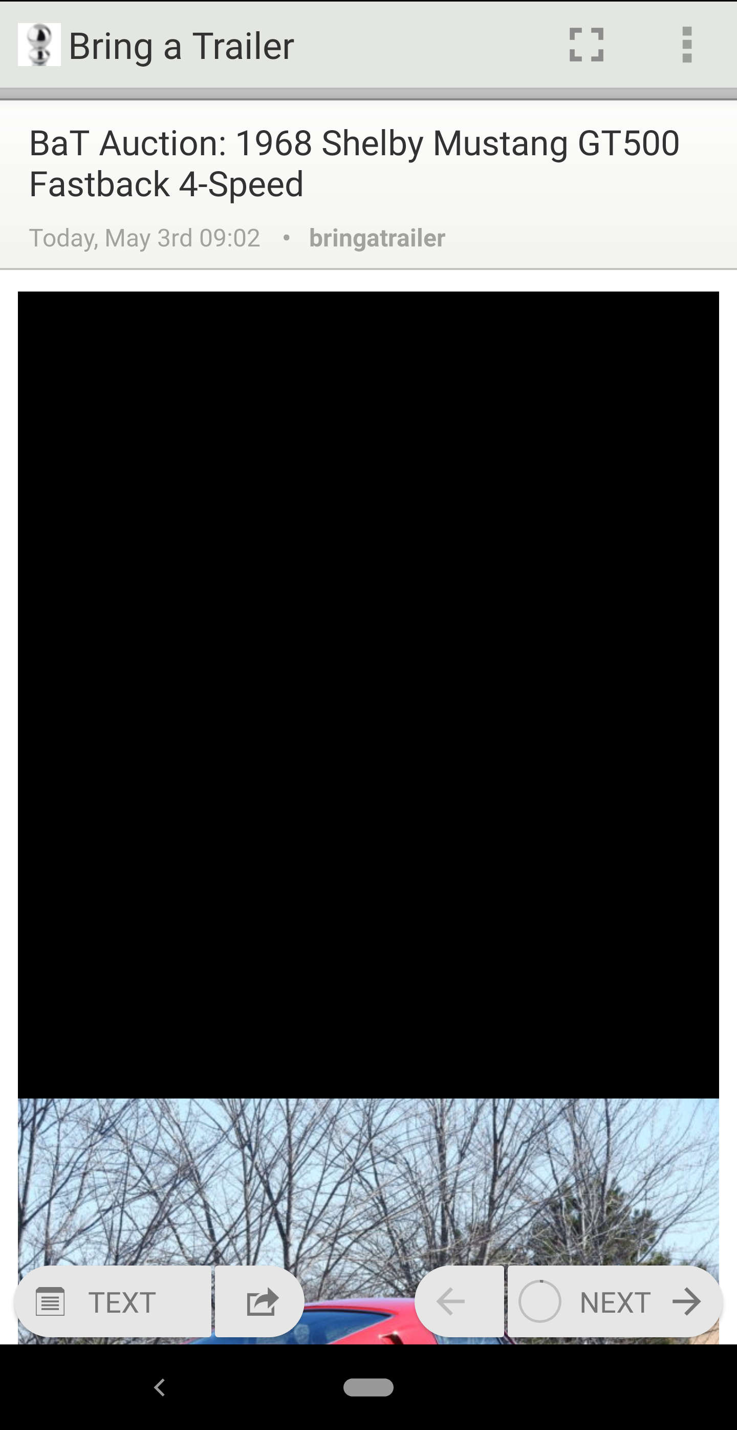
So for the last several years, I’ve been recommending NewsBlur to anyone who asked about RSS readers, and was generally happy. Then, two months ago, rendering broke in the Android app; all articles were showing a big, undifferentiated black box, a situation only remedied by switching to the dark mode. Dark mode fans are legion, and anyone who uses it regularly wouldn’t notice, but I’m old and prefer black text on a light background to avoid giving myself a headache. I was, therefore, less than thrilled to be forced into using dark mode as a workaround.
Here’s an example of what I mean:

Now, I understand that problems happen, and things don’t always get fixed overnight, but as the weeks dragged on, I was getting more than a little annoyed. This isn’t just an app I use regularly; it’s a service for which I pay an annual subscription fee. After a month, I was wondering about alternatives; after almost two, I was sufficiently irritated to post my annoyance on the support website, after the owner1 posted that if it wasn’t fixed in a week, he’d look into getting another developer. Really? Seven weeks wasn’t long enough already?
Shortly afterward, I said the hell with it, downloaded Feedly, and set up a subscription. It’s been an adjustment; I’m used to things working a certain way, and the UI is sufficiently different from what I was used to that it was initially off-putting until I figured out the flow. After a week, I’m starting to like it; it works well, has fewer little glitches than NewsBlur, and just generally looks more polished and modern. NewsBlur still looks like an iOS 7 app, even on Android. It works (well, until recently), but it isn’t pretty.
The downside is that Feedly Pro is about twice the price of NewsBlur Premium on an annual basis. And I just renewed NewsBlur for another year shortly before the app broke. Ouch.
So this morning, the NewsBlur owner announced that he’d finally hired another Android dev and was hoping the problem would be fixed within the week. Hey, great. Wish he’d done it about five weeks ago. But now I have another decision to make, and that’s whether to stick with NewsBlur, assuming the problem actually gets fixed, or to bite the bullet and migrate permanently to Feedly. I’ve got until May 24 to decide; on that day, they’ll bill my credit card if I don’t cancel. NewsBlur will save me money, but their reputation has just taken a huge hit. It’s been unusable on my phone for two months, and I can’t shake the feeling that if it was the iOS app that broke (i.e., if the owner used the broken app), it would have been fixed a long time ago. I’m very tempted to walk away.
And therein lies a lesson: if you take too long to fix something that’s broken, don’t be surprised when your customers start looking at the competition, and figuring out if keeping their business with you is worth the hassle. Because at the end of the day, your customers have choices, and they don’t have to choose you.
I’m not going to call him the dev in this case; he created the service, but he farms out the app development to others.